Blufish Design StudioBrand Evolution
-
After 20 years in business, Blufish Design Studio had grown, evolved, and found its own place in the creative world. But its visual identity was still swimming in the playful, bright-blue-and-yellow aesthetic of its earlier days, complete with plenty of beach and ocean-inspired wordplay. It was time for the brand to catch up with the agency behind it.
-
How do you evolve a familiar, personality-driven brand without losing the fun that made it memorable in the first place? The goal was to create a more sophisticated identity that reflected the agency's growth and creative confidence, while giving its playful personality an entirely new expression.
-
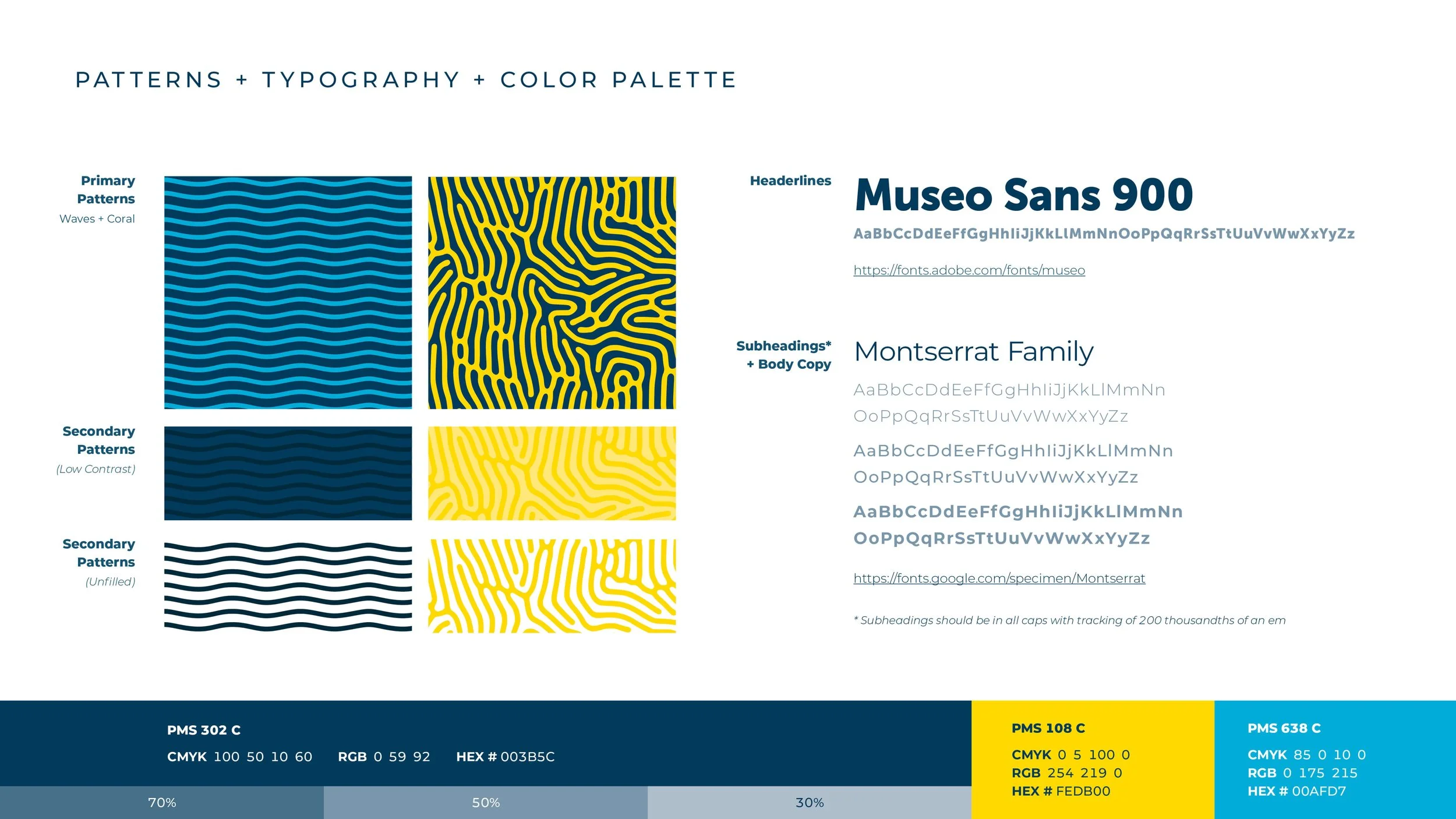
A fresh take on playful. Think less San Diego surf shop, more European beach club. We kept the energy and personality but turned up the sophistication with intensely saturated colors, bold graphic elements, and two distinctive patterns that became the foundation of the new visual language. The result was a brand that felt more confident, more contemporary, and a whole lot harder to ignore.
-
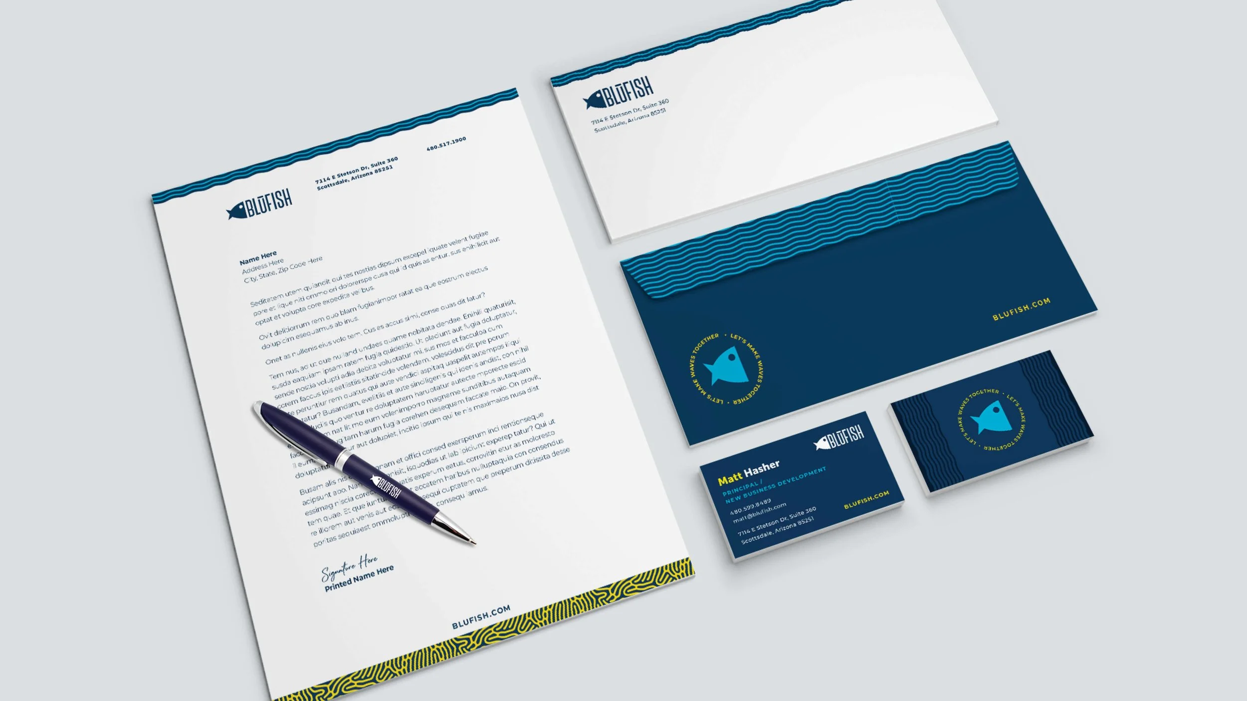
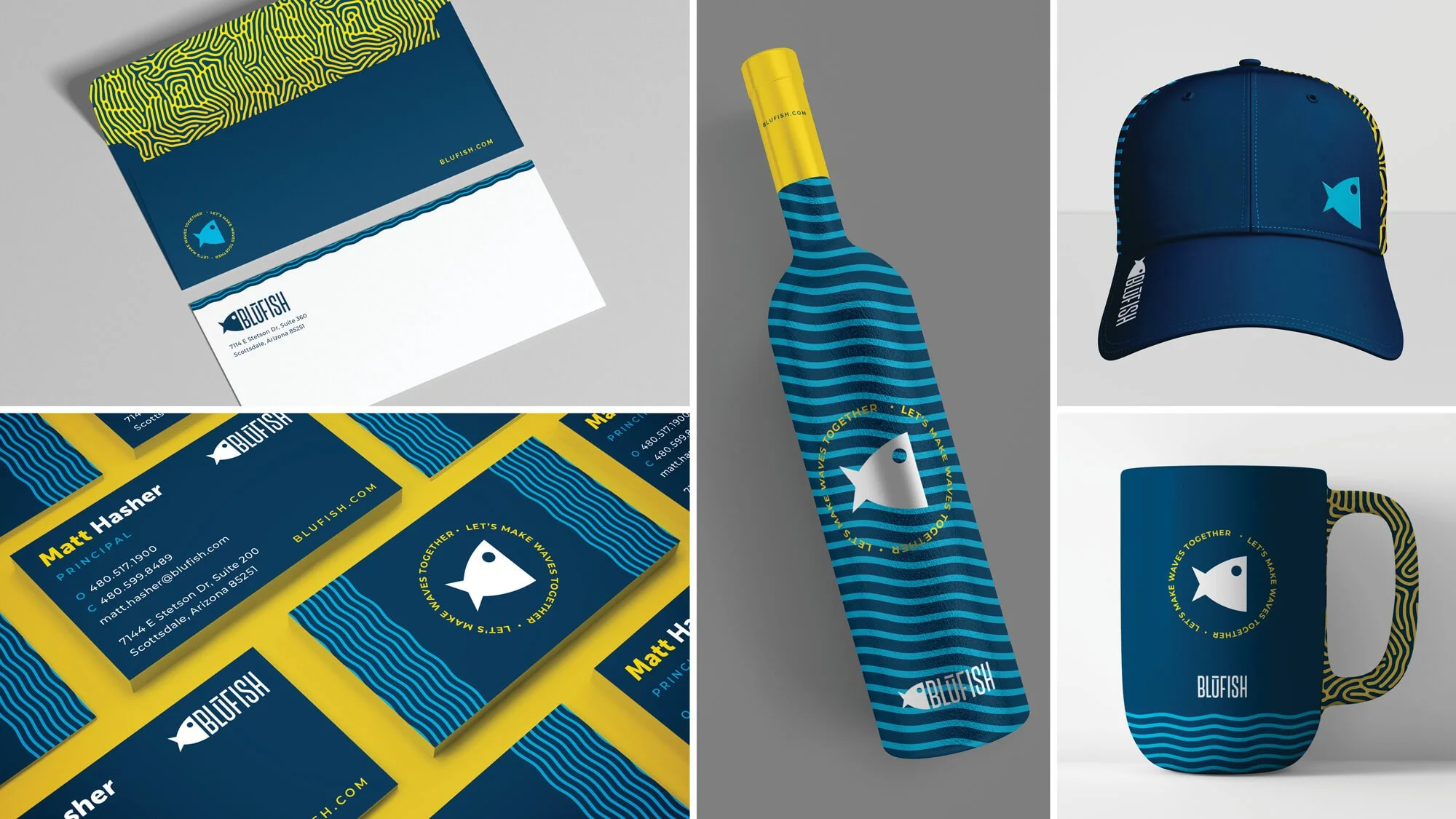
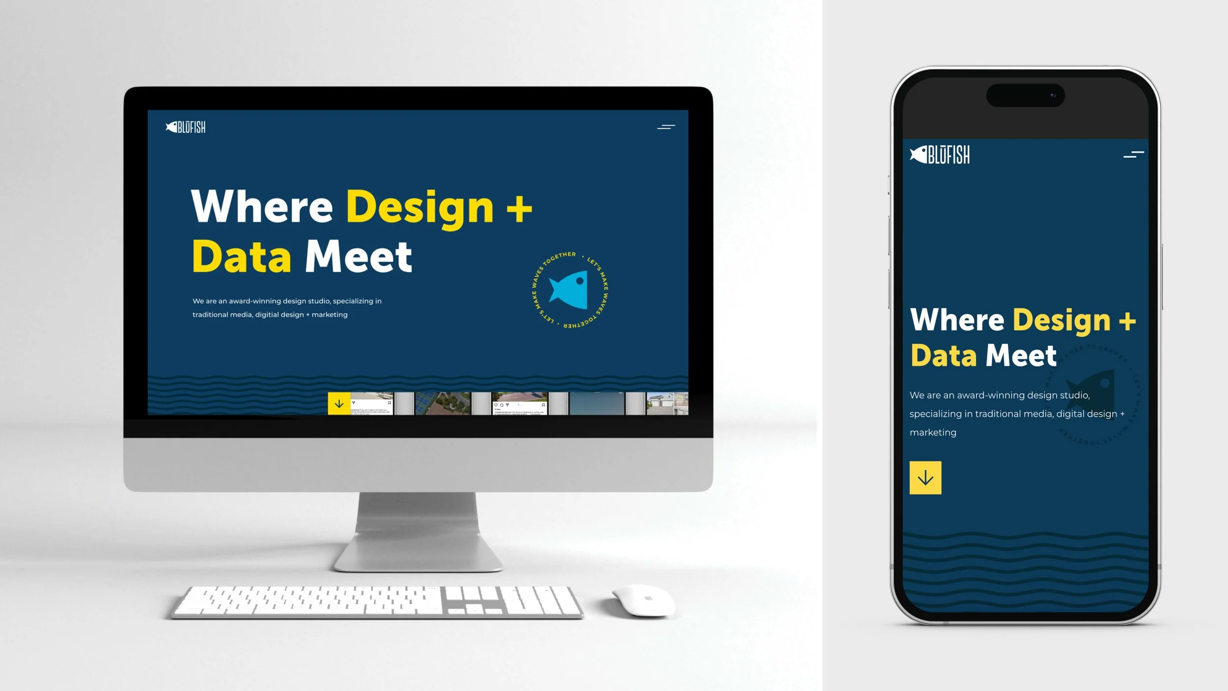
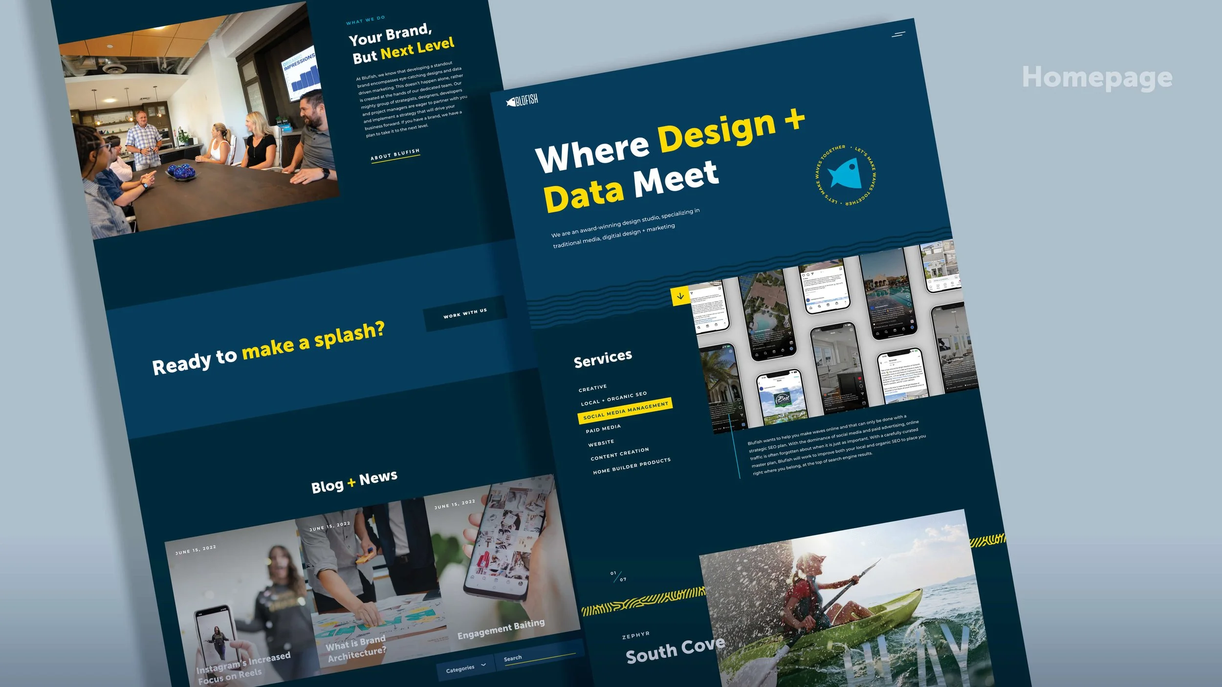
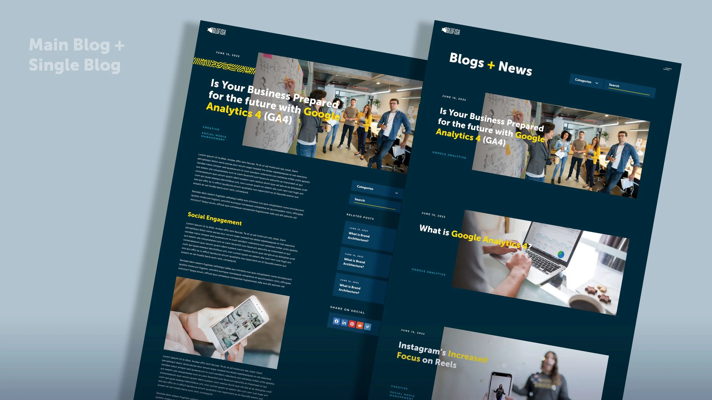
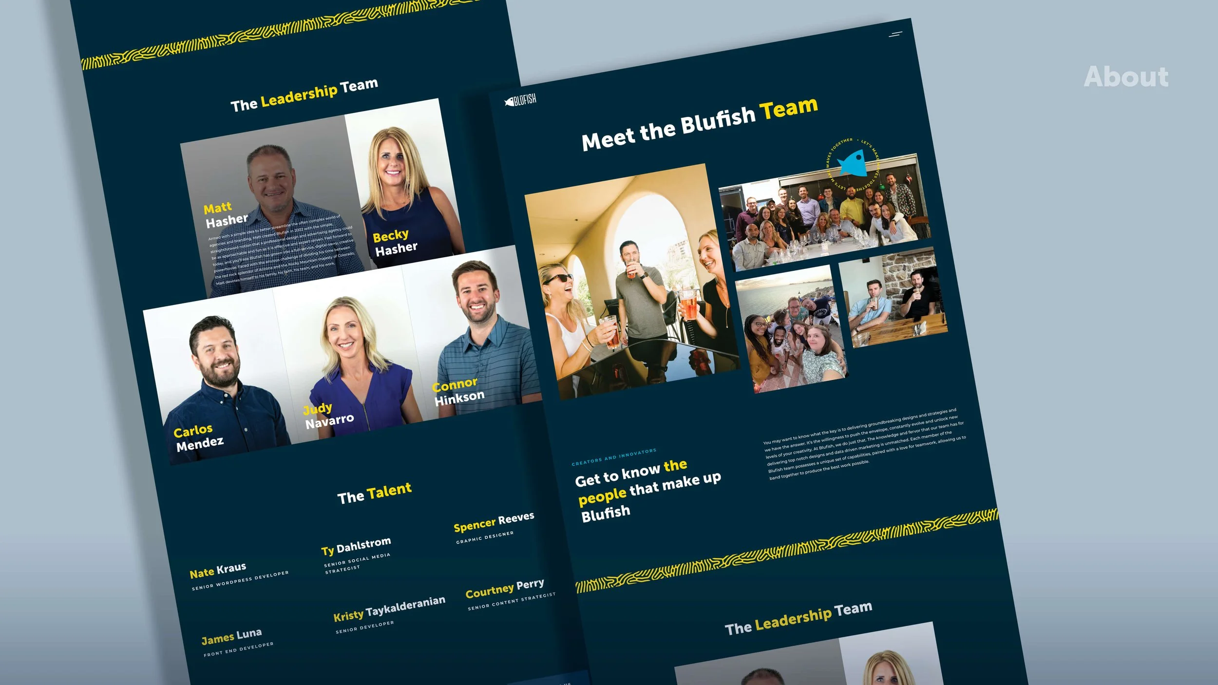
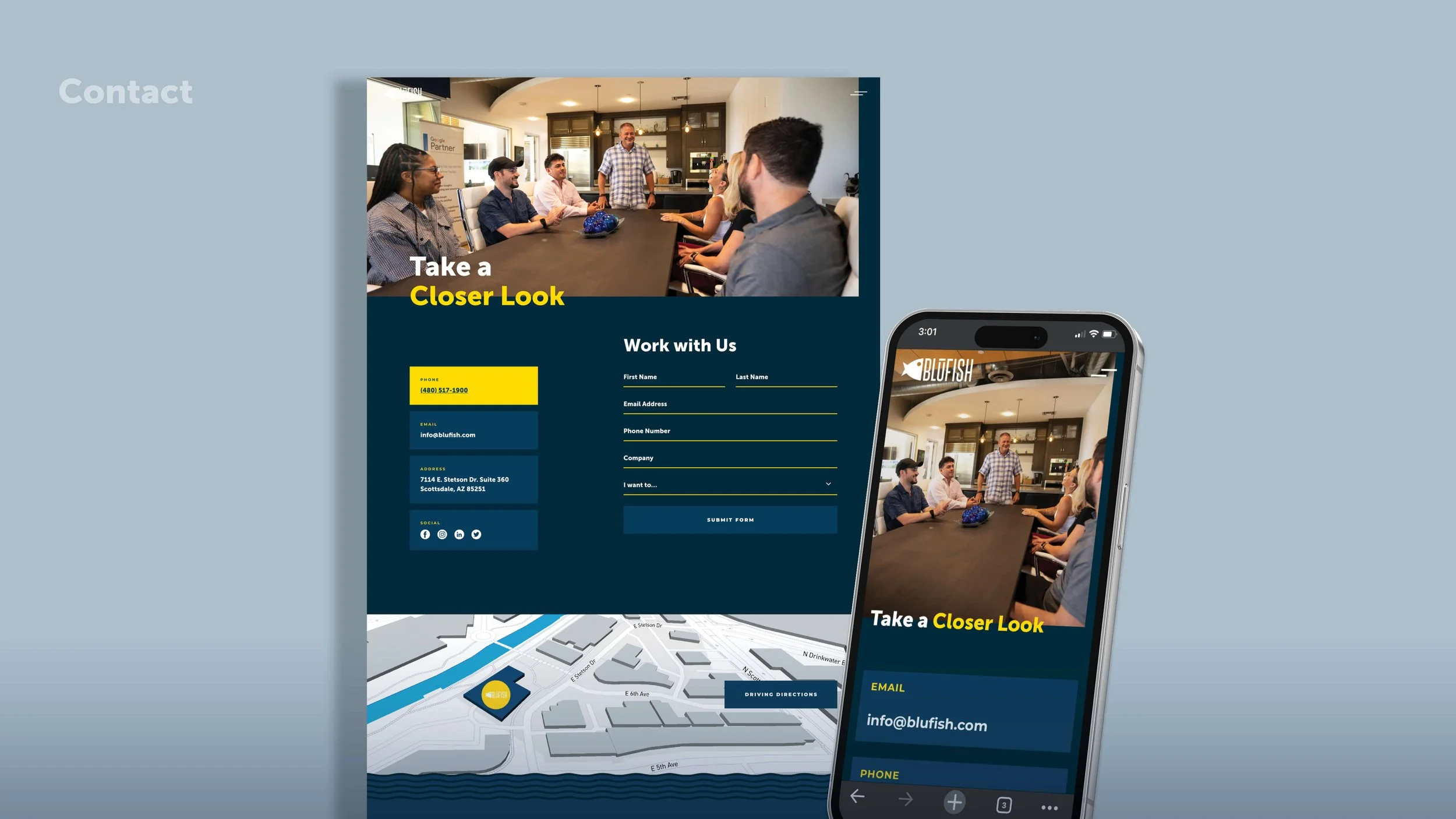
The new identity made its way across the Blufish brand experience, including print materials, signage, website design, and swag. The patterns, color palette, and graphic elements created a flexible visual system that brought consistency to every touchpoint while leaving plenty of room for personality.
-
A brand that finally reflects the agency it has become. Still playful, still full of personality, but with a more sophisticated point of view and a bold new look. Twenty years in, Blufish wasn't ready to grow up and get boring. It was ready to play by a whole new set of rules.