BLVD BUILDERSA Family of Brands, Designed to Stand Apart.
-
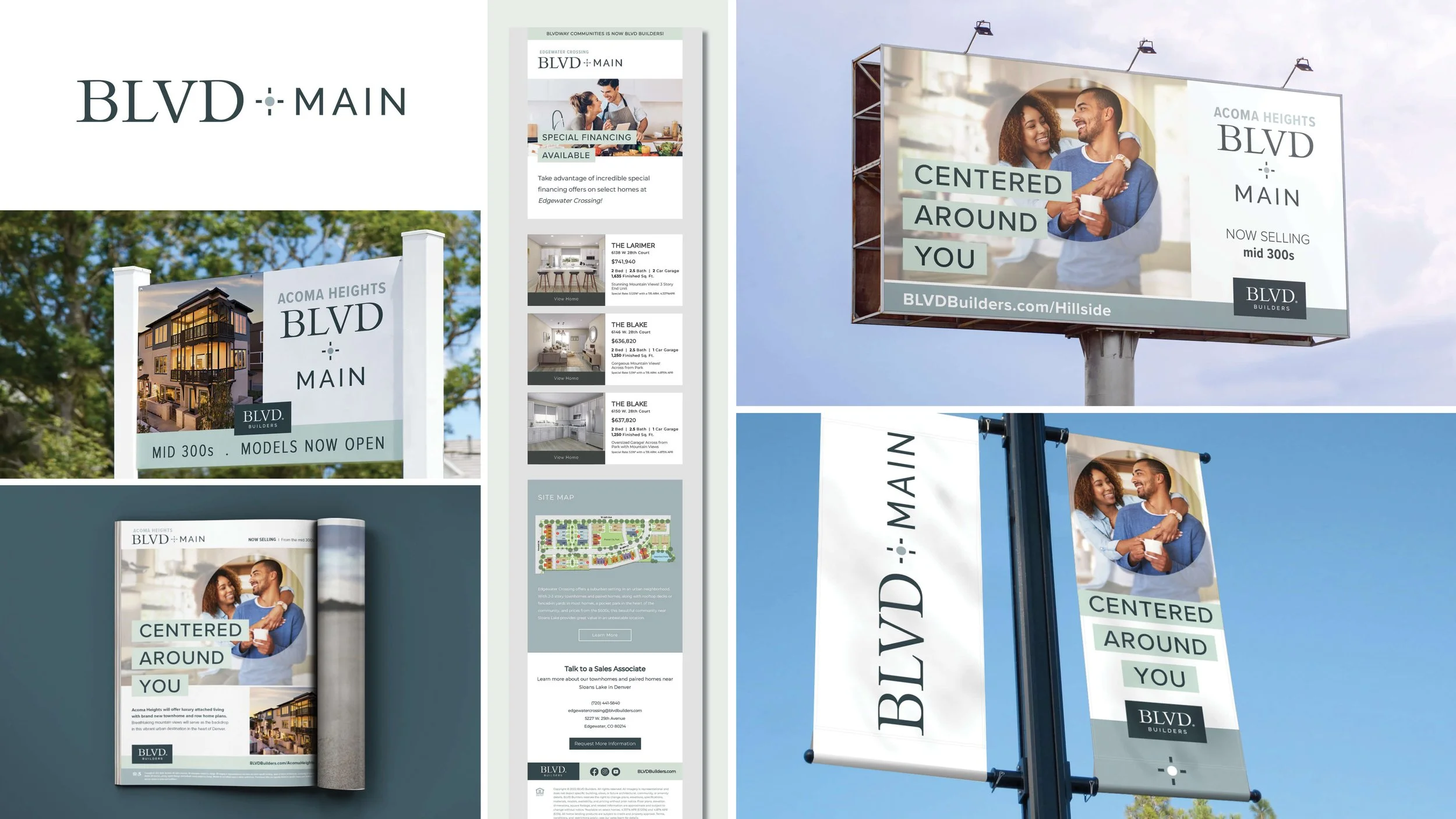
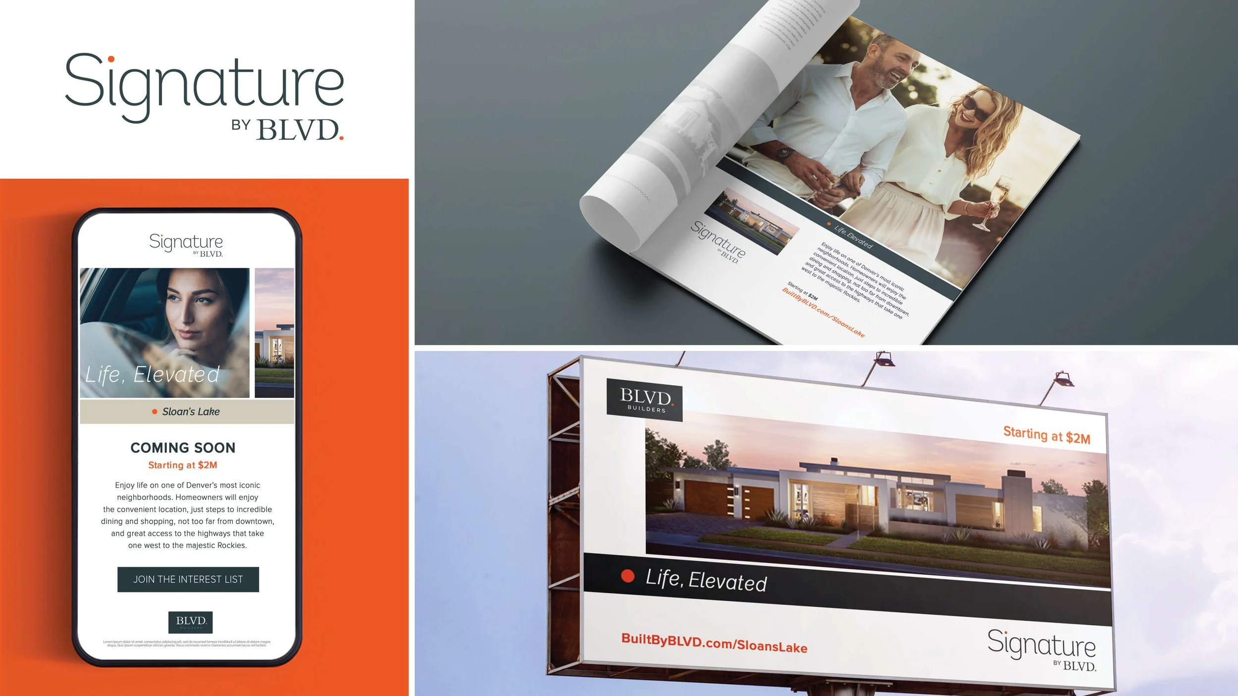
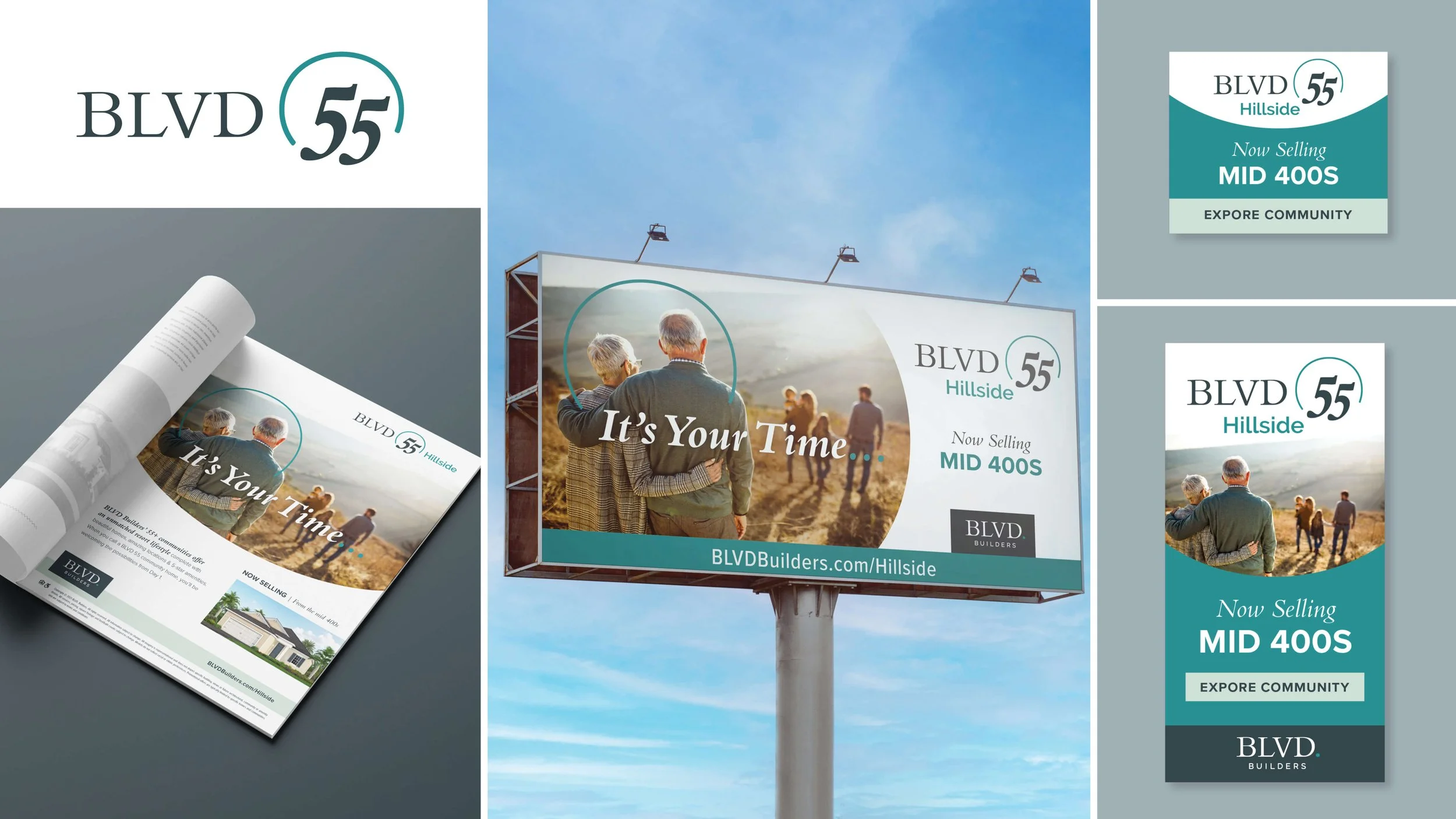
BLVD Builder needed to establish a visual identity for three distinct product lines, each targeting a different audience: luxury homebuyers, active adults 55+, and high-density residential developers. The challenge was to give each sub-brand its own personality and market appeal without losing its connection to the parent brand.
The goal was to create a cohesive brand family that felt anything but cookie cutter.
-
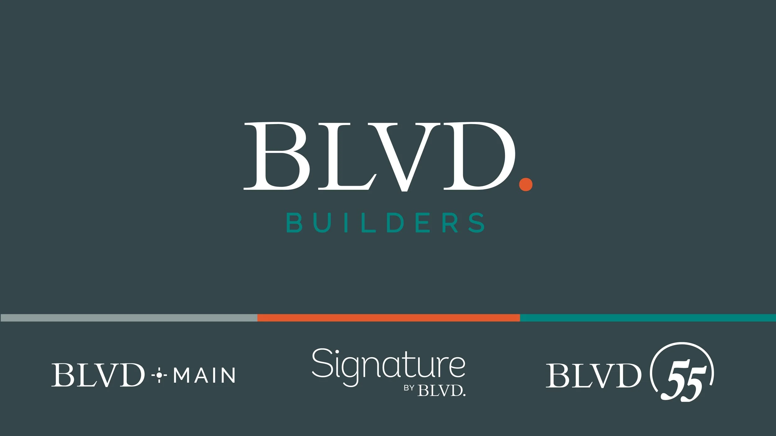
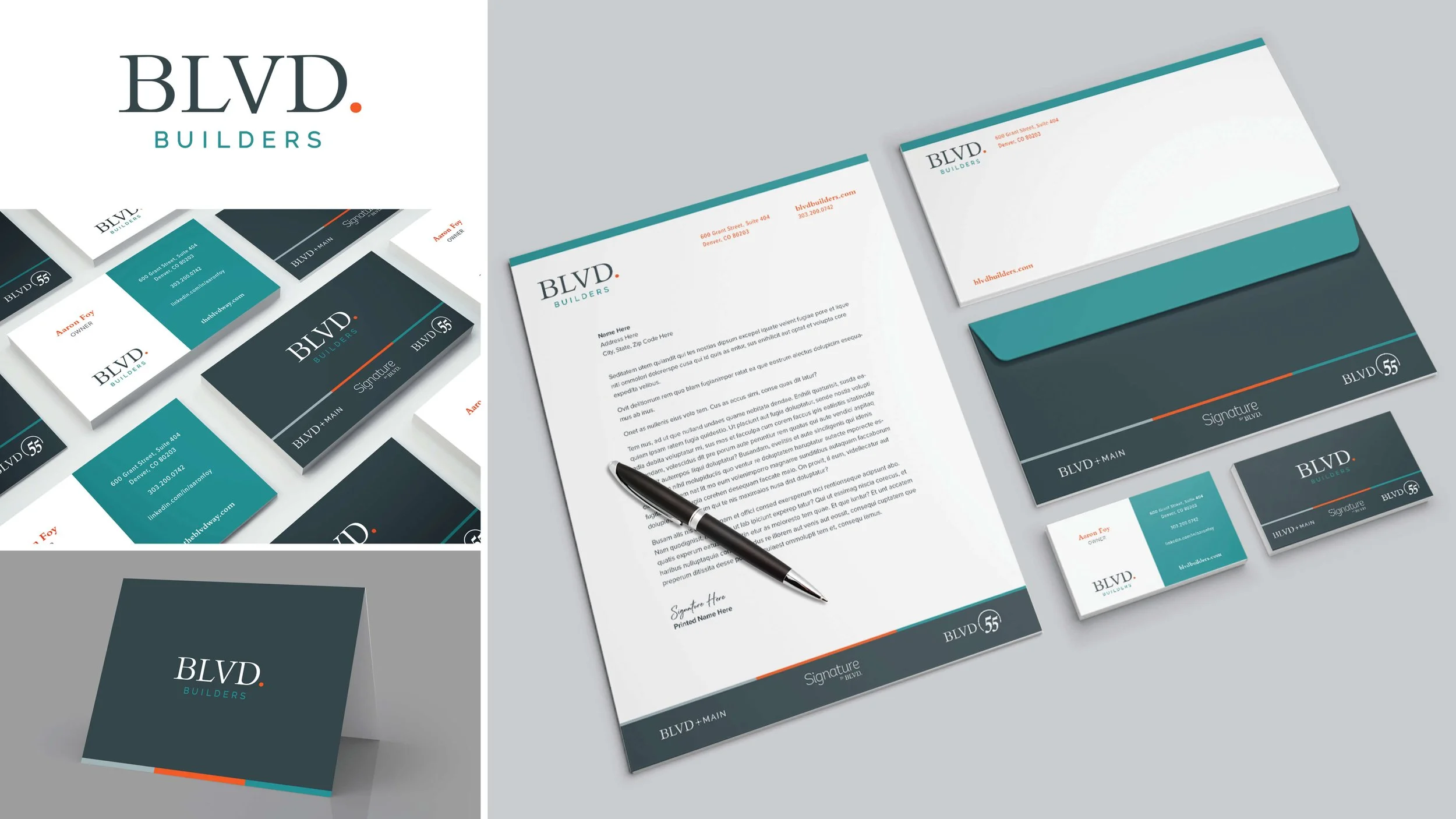
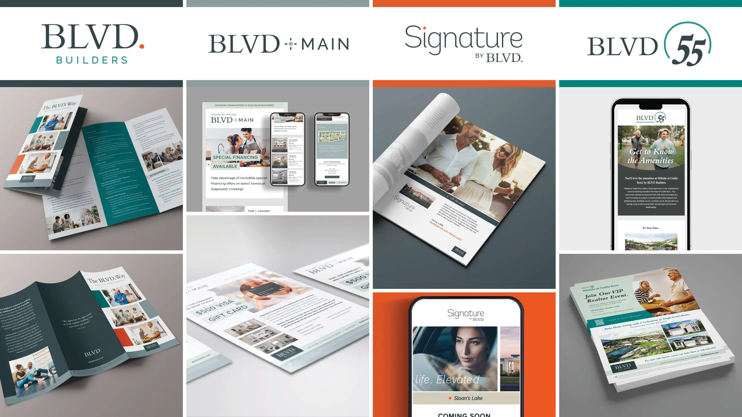
I developed a graphic system that allowed each sub-brand to stand on its own while maintaining a recognizable connection to BLVD Builder. Each received a custom logo incorporating the parent brand's signature serif mark, a consistent use of grey tones, and a unique complementary color palette.
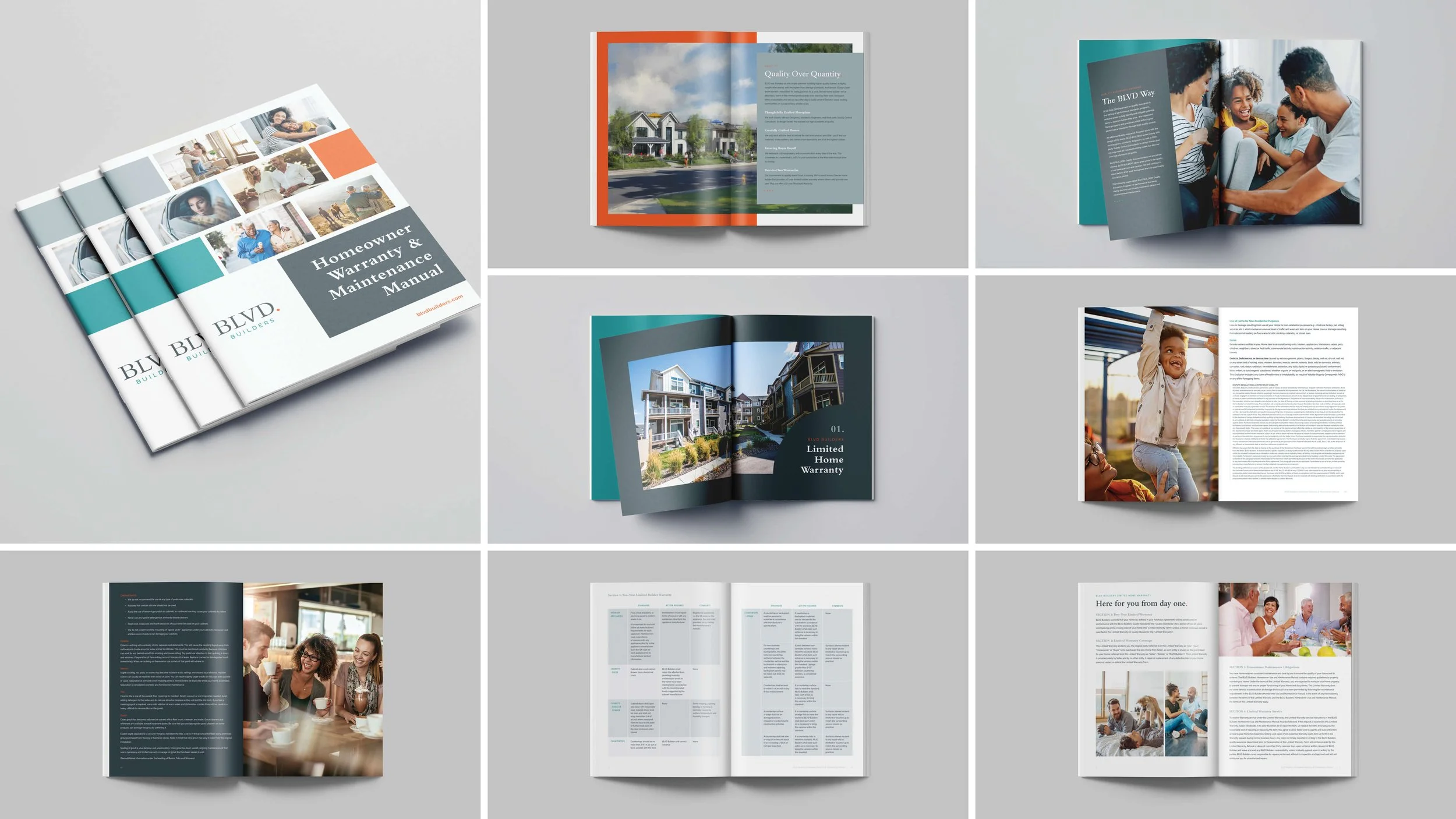
From there, I established distinct visual languages for each audience. The high-density line took a fresh, approachable direction with bold color blocks and circular graphic elements. The luxury line embraced a more understated aesthetic, allowing beautiful photography and generous white space to take center stage. The 55+ line brought energy and personality through vibrant colors and expressive graphic treatments layered over lifestyle photography.
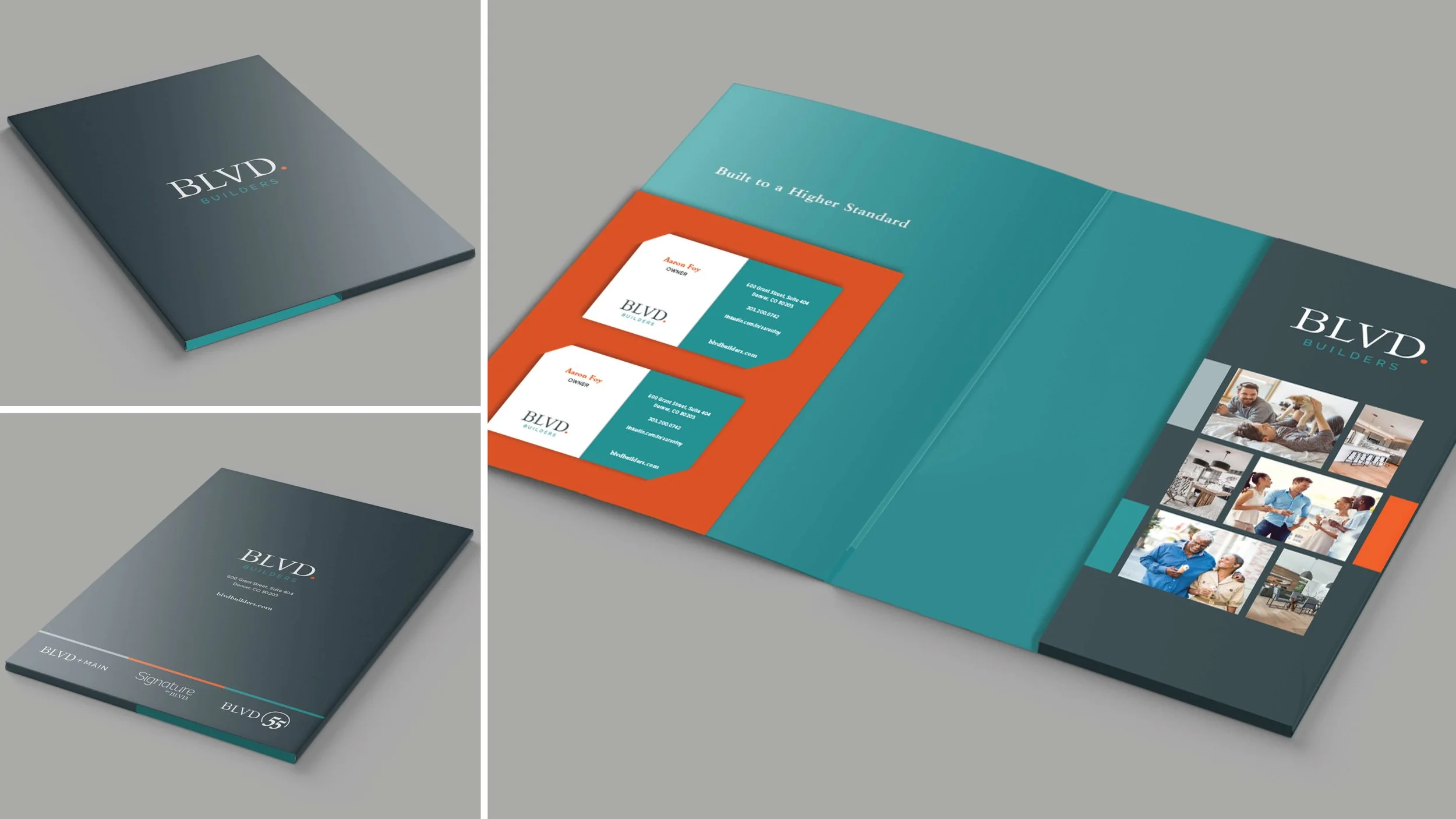
Across the parent brand, a flexible palette of complementary colors and graphic elements created room for creative variety without sacrificing consistency.
-
Parent brand graphic system and visual guidelines
Three sub-brand logos and complementary color palettes
Distinct visual directions for each product line
Photography and graphic treatment standards
Marketing collateral and branded layouts
Ongoing creative assets and brand applications
-
Three distinct identities, one cohesive brand family. Each product line speaks directly to its audience through its own visual personality, while shared design elements create a clear connection to BLVD Builder. The result is a flexible, recognizable graphic system that gives the brand room to grow without losing sight of who it is.